- Monospace Font
- Mono Font
- Monospace Fonts
- Fixed Width Fonts
Monospace Fonts for UI and Code: When to Use Them
Choose monospace fonts for code, data, and product UI—use cases, selection criteria, recommended mono faces, CSS stacks, and when proportional type is better.

Sherotree
·7 min read
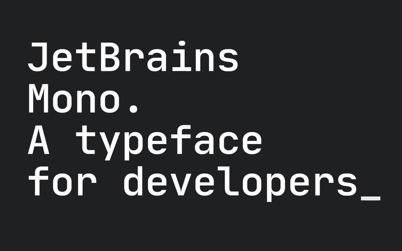
A monospace font (also called a mono font or fixed width font) gives every character the same advance width. That single rule makes monospace indispensable for code—and surprisingly useful in product UI when you need alignment, scannable IDs, or a deliberate “engineering” voice.
This guide maps when monospace helps, how to pick a face for screen UI, a short list of solid monospace fonts, and how to wire a sensible CSS stack. Pair sizing with Typescale; identify mono stacks on live sites with Fonts Ninja.
Key Takeaways
- Use monospace for code, IDs, logs, and aligned columns—not as a default body face for long marketing copy.
- Judge mono candidates on 0/O and 1/l/I distinction, x-height, weight range, and license—not only aesthetics.
- Prefer WOFF2 with a short Unicode subset; keep a system mono fallback (
ui-monospace, SFMono-Regular, Menlo, Monaco, Consolas, monospace).
What monospace is (and is not)
In proportional type, i is narrower than M. In fixed width fonts, both occupy the same horizontal slot. That is why code columns line up and why ASCII diagrams survive copy-paste.
Monospace is not:
- Automatically “more readable” for paragraphs (usually the opposite)
- Required for every number in a UI (tabular lining figures in a proportional face often suffice)
- A substitute for good syntax highlighting or spacing in design systems
Where monospace earns its place
| Use case | Why mono helps | Design note |
|---|---|---|
| Code blocks & editors | Glyph alignment, copy-paste fidelity | Prioritize clarity of punctuation and brackets |
| API keys, hashes, SKUs | Characters stay distinguishable in one metric | Stress 0/O and 1/l/I tests |
| Logs & CLI-inspired UI | Visual “terminal” affordance | Keep line length manageable |
| Simple data columns | Digits and units align without tables of figures | For finance UIs, compare against tabular nums first |
| Brand / marketing accent | Signals technical product DNA | Limit to short labels or hero accents |
Skip monospace when: you are setting multi-sentence help text, blog body copy, or dense navigation labels where proportional rhythm reads faster.
How to choose a mono font for product UI
Score candidates with this checklist:
- Ambiguous characters — Print
O0o Il1| 8B 5Sat 13–14px. Fail anything that collapses. - x-height & punctuation — Code is punctuation-heavy; weak commas and periods hurt.
- Weights — UI often needs Regular + Medium + Bold; italics are optional for code.
- Ligatures — Coding ligatures (
=>,!=) are a preference—offer a way to disable them in editor themes. - License — OFL/Apache-style faces are easiest for apps and docs sites; retail mono needs a webfont/app clause.
- Variable axes — Useful for optical sizing; do not ship unused axes.
Recommended monospace fonts
Verify each family’s live license page before shipping.
Free / open — strong defaults
| Font | Best for | Notes |
|---|---|---|
| JetBrains Mono | Editors, docs code samples | Excellent clarity; coding ligatures optional |
| IBM Plex Mono | Product UI + code in one system | Matches Plex Sans/Serif families |
| Source Code Pro | Long-standing web/docs default | Safe, familiar, widely hosted |
| Fira Code | Ligature-friendly code samples | Great for tutorials; disable ligatures if they confuse beginners |
| Roboto Mono | Material-adjacent products | Consistent with Roboto UI stacks |
| Space Mono | Display / brand mono moments | Better for accents than dense code |
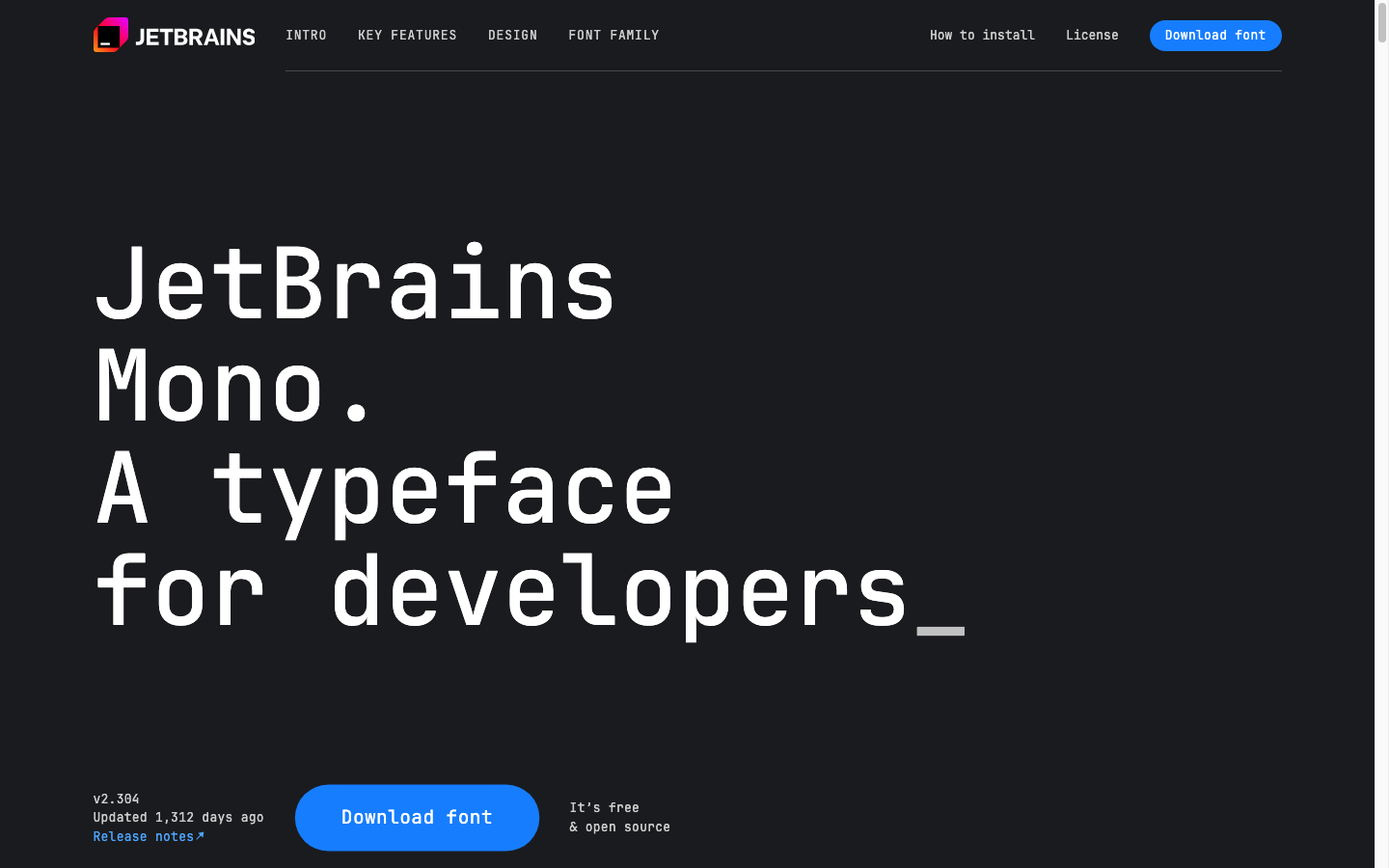
Browse more mono families on Google Fonts (filter by monospace) or foundry pages. Catalog size on Google Fonts sits around 1,940+ families overall—mono is a subset; confirm filters on the live site.
When you want more character
| Direction | Example path | Caution |
|---|---|---|
| Soft, rounded mono | Search “rounded monospace” on foundry sites | Soft forms can blur at 12px |
| Retro terminal | Classic faces inspired by older CRTs | Novelty burns out in large products |
| Retail coding fonts | Paid editor faces with optical sizes | Budget webfont + app licenses separately |
For free modern non-mono companions around code marketing pages, see Fontshare and the best web fonts guide.
Mixing mono with proportional type
A durable pattern for SaaS marketing + docs:
- Proportional sans for UI chrome and body
- Mono for
<code>, tokens, and CLI screenshots - Optional display face only on campaign heroes
Rules of thumb:
- Keep mono 0.9–1.0× the surrounding body size; mono often looks larger optically.
- Add slightly more line-height in code blocks (1.5–1.7).
- Do not set entire landing pages in mono unless the joke is the terminal aesthetic.
Generate contrasting pairs (sans + mono-friendly companions) on Fontjoy.
CSS: a practical stack
:root {
  --font-sans: ui-sans-serif, system-ui, -apple-system, Segoe UI, Roboto, Helvetica, Arial, sans-serif;
  --font-mono: ui-monospace, SFMono-Regular, Menlo, Monaco, Consolas, "Liberation Mono",
    "Courier New", monospace;
}

code,
kbd,
pre,
.token,
.sku {
  font-family: "JetBrains Mono", var(--font-mono);
  font-size: 0.925em;
  font-variant-ligatures: none; /* enable only if you want coding ligatures */
}
Load WOFF2 for your chosen face, subset to Latin (or your scripts), and keep system mono as the fallback so content never disappears.
For modular type scales around code docs, use Typescale.
Tabular numbers vs true monospace
If your only problem is aligning prices in a table, try tabular lining figures (font-variant-numeric: tabular-nums) on a proportional UI font before switching the whole column to mono. Reach for mono when letters and digits must share a rigid grid (hashes, codes, mixed tokens).
FAQ
What is the difference between a mono font and fixed width fonts?
In practice, people use monospace font, mono font, and fixed width fonts for the same idea: equal advance widths. “Fixed pitch” is the older metal-type phrasing.
Can I use monospace for an entire website UI?
You can, but long reading and dense navigation usually suffer. Reserve mono for code and machine-readable strings unless a terminal aesthetic is core branding.
What is the best monospace font for coding?
There is no single winner. JetBrains Mono, IBM Plex Mono, Source Code Pro, and Fira Code are all strong, widely used options—pick based on glyph clarity at your editor size and whether you want ligatures.
Are monospace fonts free for commercial websites?
Many popular ones are (OFL/Apache and similar). Always open the family’s license page. Free for desktop ≠ automatically cleared for every app-embed scenario.
How do I identify which mono font a website uses?
Use a browser font identifier such as Fonts Ninja (Fonts Ninja), then confirm on the foundry or Google Fonts specimen before you adopt it.
Next steps
- List the surfaces that truly need mono (code, tokens, logs).
- Test two candidates with ambiguous-character strings at production sizes.
- Wire
code/preto a mono stack with system fallbacks. - Keep marketing body on a proportional face from your web fonts shortlist.
Enjoyed this story? Share it or follow on Google.