- Best Web Fonts
- Best Fonts
- Popular Fonts
- Web Typography
Best Web Fonts for Websites: How to Choose (Not Just Rank)
Pick the best web fonts for your site with a decision framework—UI, marketing, and long-form—plus free and commercial picks, licenses, and load tips.

Sherotree
·8 min read
There is no single best font for every website. Searches for best web fonts, best fonts, and popular fonts usually hide a more useful question: which typeface fits this job, this license, and this performance budget?
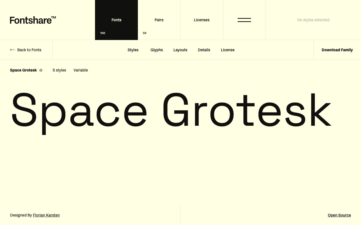
This guide answers that question with a selection framework first, then a short list of proven web fonts by scenario—UI product, marketing landing page, and long-form reading. Use pairing and scale tools when you are stuck: Fontjoy for combinations and Typescale for sizing. If you need a free modern foundry set, start at Fontshare.
Key Takeaways
- Treat “best” as fit for a job: product UI, marketing display, or editorial body—not a global ranking.
- Confirm license + language coverage + weight range before you fall in love with a specimen.
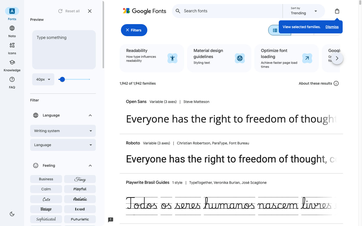
- Prefer WOFF2, subsetting, and a short stack; self-host when privacy or caching control matters (Google Fonts lists ~1,940+ families as of mid-2026—verify the live browse count).
What “best web fonts” should mean
A font that wins a “coolest fonts” mood board can still fail on a SaaS dashboard: weak numerals, missing medium weight, or a license that blocks app embedding. For websites, score candidates on:
| Criterion | Why it matters on the web |
|---|---|
| Job fit | UI text needs neutrality and many sizes; marketing needs a clear display voice; articles need reading comfort. |
| License | Desktop “free” ≠ webfont OK ≠ app embed OK. Read the live EULA or OFL text. |
| Language / script | Latin-only faces break localization mid-project. |
| Weights & italics | Product UIs often need 400/500/600/700; marketing may need a black display cut. |
| Rendering | Hinting, x-height, and spacing at 14–16px decide whether body text feels cheap. |
| File cost | Variable fonts can replace many static files—or bloat if you load every axis unused. |
Information gain: Popularity (how often a face appears on the web) is a risk signal as much as a quality signal. Inter and Roboto are excellent defaults; they rarely differentiate a brand.
Decision framework: pick by scenario
1. Product and app UI
Goal: Clarity at small sizes, calm brand, durable for years.
Prefer: Neutral grotesks / humanist sans with tabular figures when dashboards matter. See Humanist Sans Serif Fonts for when that warmth helps UI readability.
Usually skip: Ultra-display faces, extreme contrast didones, novelty scripts.
Stack pattern: One primary UI sans + system fallbacks (ui-sans-serif, system-ui, …) so first paint never depends on a network font.
2. Marketing and landing pages
Goal: Memorable headline voice without killing form readability.
Prefer: A distinctive display or high-character sans for H1–H2; keep body on a quieter face.
Usually skip: Using the same loud display face for paragraphs and fine print.
Stack pattern: Display for heroes → workhorse sans or serif for body → mono only for code snippets if needed.
3. Long-form / editorial
Goal: Reading stamina for 1,000+ words.
Prefer: Text or old-style serifs with decent screen cuts; or highly readable sans with generous x-height.
Usually skip: Tight tracking display fonts as body text.
Recommended web fonts by job (with use / don’t-use)
These are starting shortlists, not eternal top-10 trophies. Always re-check licenses on the publisher page before shipping.
Product UI (free / open)
| Font | Why it works on the web | Use when | Skip when |
|---|---|---|---|
| Inter | Designed for screens; large UI ecosystem | Dashboards, docs, dense UI | You need strong brand personality |
| Source Sans 3 | Clear Adobe open family; solid weights | Neutral product chrome | You want geometric “startup” flavor |
| IBM Plex Sans | Technical but warm; good numerals | Data-heavy products | Soft consumer lifestyle brands |
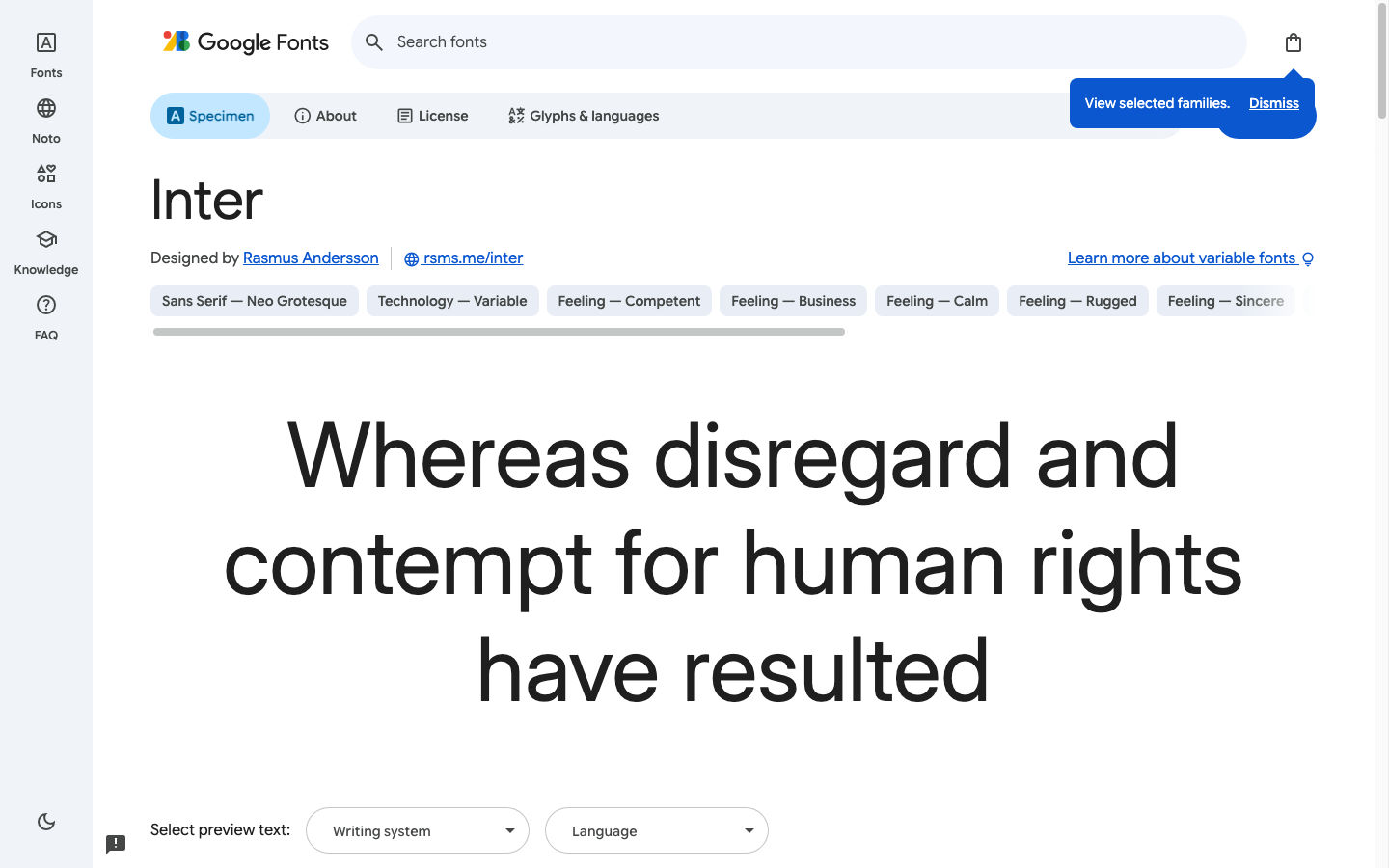
Browse and self-host packages via Google Fonts (~1,940+ families on the public browse UI—confirm live). For Inter-specific snippets, see Inter.
Product / brand (free, more character)
| Font | Why it works | Use when | Skip when |
|---|---|---|---|
| Satoshi (Fontshare) | Retail-feeling modern sans | Brand UI that should not look “default Google” | You need full OFL redistribution rights—read ITF FFL |
| Switzer (Fontshare) | Flexible neo-grotesk range | Marketing + product shared system | You only need a tiny single weight |
Details and pairing notes: Satoshi font guide and Fontshare.
Marketing display (mix of free)
| Font | Why it works | Use when | Skip when |
|---|---|---|---|
| Playfair Display | High-contrast serif drama | Fashion, editorial heroes | Tiny UI labels |
| Space Grotesk | Geometric, tech-forward | Startup heroes, feature titles | Long paragraphs (also a common Futura alternative) |
| Fraunces | Soft optical axis personality | Soft brand storytelling | Strict enterprise tone |
Long-form reading
See Serif Fonts for Web and Brand for style categories (old style, transitional, didone, slab) and more serif examples.
| Font | Why it works | Use when | Skip when |
|---|---|---|---|
| Source Serif 4 | Screen-aware serif | Docs, blogs, help centers | Ultra-minimal tech brands that reject serifs |
| Literata | Built for reading apps | Long articles, publishing | Loud campaign posters |
| Newsreader | Editorial flavor | Magazine-like sites | Dense data tables as body |
How to validate a font before you commit
- Set real copy at 16px / 1.5 line-height—not only the foundry pangram.
- Check numerals in prices, tables, and version strings.
- Test medium (500) if your UI uses it—many “free” families skip it.
- Load only what you use (WOFF2; subset Latin or your script; limit axes).
- Document the license in the repo (link + date checked).
If you are reverse-engineering a competitor’s stack, identify faces with a proper font identifier workflow (Fonts Ninja)—then still buy or host under your license, not theirs.
Pairing and scale without guesswork
- Generate contrast-aware pairs on Fontjoy.
- Lock a modular scale on Typescale so H1→body rhythm stays consistent when you swap families.
- Prefer one display + one text face. A third face is rarely hierarchy—it is usually noise.
Common mistakes when chasing “popular fonts”
- Cool over clear: Display faces in form labels and error text.
- Ignoring license: Personal-use downloads shipped in a paid product.
- Loading the universe: Every weight and italic “just in case.”
- No fallback plan: FOIT/FOUT with empty boxes on slow networks.
- Same face everywhere: No contrast between brand voice and UI chrome.
FAQ
What are the best web fonts in 2026?
There is no universal winner. For product UI, start with Inter, Source Sans 3, or a Fontshare grotesk like Satoshi; for marketing heroes, pair a display face with a quiet body font; for articles, prefer a screen-tuned serif such as Source Serif 4 or Literata.
Are popular fonts good web fonts?
Sometimes. Popularity proves rendering and language coverage in the wild, but it also means your brand looks familiar. Use popular faces as safe defaults, then differentiate with a secondary display or a less ubiquitous free foundry family.
Is Google Fonts enough, or do I need paid fonts?
Google Fonts is enough for many products and content sites. Pay when you need exclusive brand identity, specialized scripts, or retail families not released under open licenses. Free foundry programs (for example Fontshare) sit between “generic open” and “full retail.”
How do I choose between sans and serif for a website?
Default UI and SaaS marketing still skew sans for chrome and CTAs. Use serif when reading length or editorial tone is the product (publishing, long essays, some luxury brands). Mixing a serif headline with a sans body is a stable pattern.
What is the difference between “best fonts” and “best web fonts”?
“Best fonts” is often aesthetic or print-oriented. Best web fonts implies screen rendering, webfont formats, performance, and licenses that allow website embedding.
Next steps
- Write your scenario (UI / marketing / editorial) and hard constraints (languages, budget, exclusivity).
- Shortlist two candidates per role and test real UI copy.
- Build the stack with Typescale and optional pairs from Fontjoy.
- Ship WOFF2 subsets and keep the license link next to the font files.
For catalog browsing beyond this shortlist, compare free modern sources in Best Free Modern Font Sites for Designers.
Enjoyed this story? Share it or follow on Google.