- Humanist Sans
- Humanist Sans Serif
- Sans Serif Typefaces
- UI Typography
Humanist Sans Serif Fonts: What They Are and When to Use Them
Learn what humanist sans serif typefaces are, how they differ from geometric and grotesk sans, and which humanist sans fonts work best for UI, branding, and the web.

Sherotree
·7 min read
A humanist sans serif (also called a humanist sans or humanist sans-serif typeface) keeps the open proportions and calligraphic rhythm of Renaissance letterforms—but without serifs. Designers reach for humanist sans serif typefaces when they want a sans that feels approachable and readable, not cold or mechanical.
This guide explains how humanist sans differs from geometric and neo-grotesk families, when it is the right choice for product UI and marketing, and a short list of humanist sans serifs worth testing on the web. Lock sizes with Typescale, explore pairs on Fontjoy, and browse trend research at Typewolf.
Key Takeaways
- Humanist sans fonts inherit pen-shaped contrast and open apertures (c, e, s)—they read warmer than strict geometric sans at body sizes.
- Use them for dashboards, docs, civic/education brands, and long UI copy where clarity beats display drama.
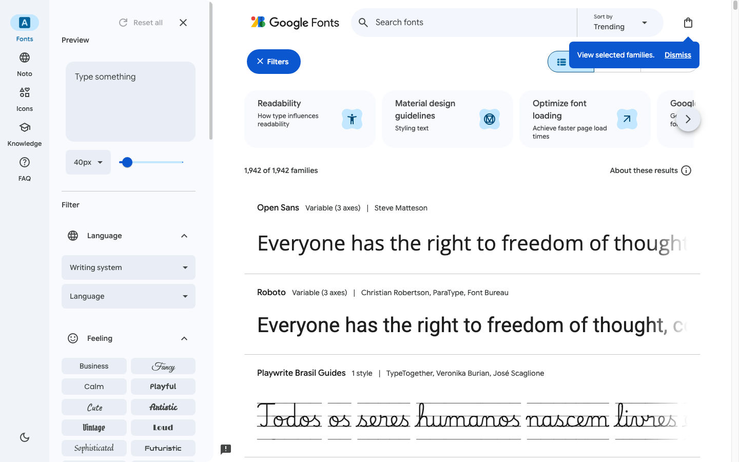
- Confirm license, weight range, and tabular figures before you commit; many free humanist families live on Google Fonts (~1,940+ families on the public browse UI—verify live).
What is a humanist sans serif?
Sans serif typefaces fall into three broad buckets designers actually use in practice:
| Category | Letterform DNA | Typical feel | Examples |
|---|---|---|---|
| Humanist sans | Roman pen influence, varied stroke, open counters | Warm, readable, “designed for people” | Frutiger, Myriad, Open Sans, Source Sans 3 |
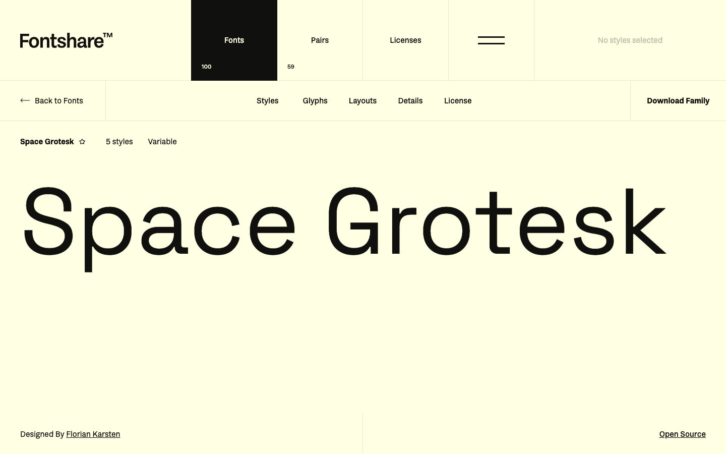
| Geometric sans | Circles and straight axes | Cool, modern, startup-tech | Futura, Avenir, Montserrat, Space Grotesk |
| Neo-grotesk | Industrial uniformity, tight spacing | Neutral, Swiss, corporate | Helvetica, Inter, Roboto |
Humanist sans serif sits between editorial serif tradition and industrial grotesk neutrality. The lowercase a is often double-story; e and c stay open; stroke contrast is subtle but real. That is why sans serif humanist stacks survive in airports, hospitals, and government sites—they communicate competence without sterility.
Information gain: “Humanist” describes construction, not quality. A geometric sans can be excellent for UI; a humanist sans can fail if weights or numerals are weak. Classify first, then test real copy.
When to choose humanist sans (and when not to)
Use humanist sans when
- Dense UI and forms — Labels, tables, and error text need legibility at 14–16px.
- Mixed audiences — Public services, education, health, and finance often benefit from a less “tech brochure” tone.
- Long in-app copy — Settings panels, onboarding, and help centers that users actually read.
- Pairing with serif display — A humanist sans body balances editorial serif headlines without clashing construction.
Skip humanist sans when
- You need a strict geometric brand (luxury minimal, brutalist poster, retro space-age).
- The product voice is terminal/CLI — a grotesk or mono accent may fit better.
- You only need a single display headline — a geometric or high-contrast face may carry more personality per pixel.
For a broader “best web fonts by job” framework, see Best Web Fonts for Websites.
Recommended humanist sans serif fonts for the web
Always re-check each family’s live license page before shipping. These are starting points, not a permanent top-10 ranking.
Free / open — strong UI defaults
| Font | Why it fits the humanist lane | Use when | Skip when |
|---|---|---|---|
| Source Sans 3 | Adobe’s open workhorse; clear humanist proportions | Docs, intranets, neutral SaaS | You want a geometric “startup” silhouette |
| Open Sans | Extremely familiar; open counters | Maximum readability for broad audiences | You need a distinctive brand voice |
| Noto Sans | Humanist-ish neutrality with huge script coverage | Multilingual products | Latin-only microsites with a tighter budget |
| IBM Plex Sans | Technical but warm; solid numerals | Data products, dev tools with human tone | Ultra-soft lifestyle branding |
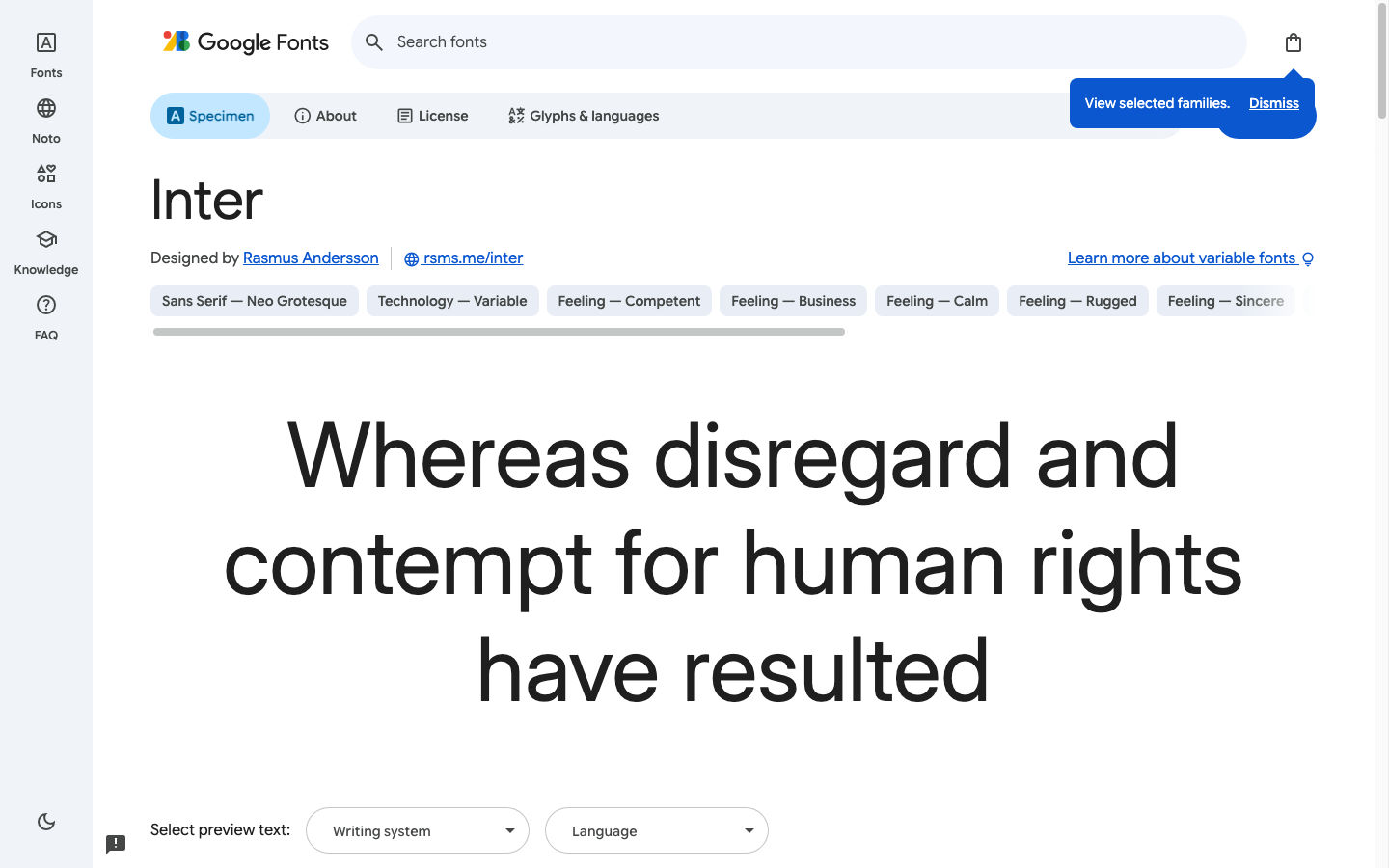
| Inter | UI-native spacing; large ecosystem (neo-grotesk/humanist hybrid) | Dashboards, design systems | You reject “popular default” aesthetics |
Embed and specimen notes for Inter: Inter.
Free with more character (Fontshare)
| Font | Notes | Use when |
|---|---|---|
| Switzer | Neo-grotesk with humanist readability | Shared marketing + product system |
| Satoshi | Modern grotesk leaning warm | Brand UI that should not look like default Google |
See Fontshare and the Satoshi font guide for license and pairing detail.
Retail classics (license required)
Frutiger, Myriad Pro, and FF Meta remain reference humanist sans serif typefaces in print and signage. On the web they are viable when the brand budget includes proper webfont or app licenses—never substitute desktop OTFs from random mirrors.
Humanist sans vs geometric sans (quick comparison)
| Question | Humanist sans | Geometric sans |
|---|---|---|
| Brand temperature | Warmer, institutional, trustworthy | Cooler, editorial, “designed object” |
| Body text at 16px | Usually safer for long UI copy | Can feel tight or stiff if spacing is wrong |
| Headlines | Calm authority | Strong graphic shape |
| Pairing | Works with old-style serifs | Works with high-contrast didones or mono accents |
If your brief says “Futura vibe but more readable,” you are often looking for a humanist-geometric hybrid or a Futura alternative—not a pure humanist list.
How to test humanist sans on real UI copy
- Set nav, table, and paragraph at the sizes you ship—not only the foundry pangram.
- Stress numerals in pricing, dates, and version strings; enable tabular figures if the family supports them.
- Check Medium (500) — many UI kits depend on it; confirm the file exists.
- Load WOFF2 subsets — Latin only unless you need more scripts.
- Pair intentionally — one humanist sans for UI plus one display face is enough for most products.
Generate contrast-aware combinations on Fontjoy. Identify live stacks on competitor sites with Fonts Ninja, then license your own files.
Common mistakes with humanist sans serifs
- Assuming “humanist” means unique — Open Sans and Source Sans are humanist and everywhere.
- Using humanist for hero display only — You pay for openness you do not need at 72px.
- Ignoring weight gaps — Jumping 400 → 700 with no 500/600 for buttons and chips.
- Mixing two humanist families — Helvetica + Frutiger vibes in one layout rarely harmonize.
FAQ
What is the difference between humanist sans and grotesk sans?
Grotesks (Helvetica, Inter) prioritize even color and industrial neutrality. Humanist sans serif fonts keep more stroke variation and open shapes from roman type. The line blurs—Inter is often called a UI grotesk with humanist readability—but the distinction still helps you brief and pair type.
Are humanist sans serif fonts good for websites?
Yes, especially for UI chrome, forms, and long help text. They are a safe default when your brand should feel credible rather than flashy. Pair with a display face for marketing heroes if you need more personality.
What are the best humanist sans fonts for free?
Start with Source Sans 3, Open Sans, IBM Plex Sans, or Noto Sans on Google Fonts, and Satoshi or Switzer on Fontshare if you want more brand character under free commercial terms. Always read the live license.
Humanist sans vs geometric sans—which is better for SaaS?
There is no universal winner. Humanist sans wins when readability and trust matter in dense UI. Geometric sans wins when the brand is minimalist, fashion-forward, or retro-modern. Many SaaS products use a neo-grotesk (Inter) as a practical middle ground.
Where can I research humanist sans trends?
Browse editorial lists and site examples on Typewolf, then validate choices against your license and performance budget—not trend screenshots alone.
Next steps
- Decide whether you need warm readability (humanist), graphic shape (geometric), or neutral UI (neo-grotesk).
- Shortlist two humanist sans serif candidates and test real product copy at 14–16px.
- Lock hierarchy with Typescale and optional pairs from Fontjoy.
- Document the license link next to your font files before launch.
For serif body partners in the same system, see Serif Fonts for Web and Brand. For monospace accents, see Monospace Fonts for UI and Code.
Enjoyed this story? Share it or follow on Google.