- Serif Font
- Serif Fonts
- Serif Typeface
- Serif Examples
Serif Fonts for Web and Brand: Types, Examples, and How to Choose
What is a serif font? Compare serif typeface styles—old style, transitional, modern—and pick serif fonts for websites, editorial, and brand with free and licensed examples.

Sherotree
·7 min read
A serif font (or serif typeface) adds small strokes—serifs—at the ends of main letter stems. Serif fonts carry editorial, literary, and institutional associations; used well on the web they improve long-reading comfort and give brand voice more gravity than a default sans.
This guide explains what serifs are, the main serif typeface categories with serif examples, and how to choose serif fonts for headlines, body copy, and product UI. Pair stacks on Fontjoy, lock rhythm on Typescale, and contrast with Humanist Sans Serif Fonts when you mix families.
Key Takeaways
- Serif describes construction, not “fancy”—a slab serif and a delicate old-style serif solve different problems.
- Use serifs for long articles, publishing, luxury, and editorial heroes; keep dense UI chrome on sans unless you have a strong reason.
- Test at 16–18px body with real paragraphs; screen-tuned families on Google Fonts (~1,940+ families—verify live) outperform print-first classics without web cuts.
What is a serif typeface?
In a serif typeface, finishing strokes (serifs) help the eye follow horizontal lines of text in print—and still signal “editorial” on screen when spacing and contrast are tuned.
| Term | Meaning |
|---|---|
| Serif | The small foot or flare on letter terminals |
| Serif font / serif fonts | Any family with those serifs (headlines or body) |
| Serif typeface | Same as serif font—type designer wording |
| Sans serif | Without serifs—often paired with serif for hierarchy |
Serif examples by category:
| Style | Era / feel | Serif examples (classic → web-friendly) |
|---|---|---|
| Old style | Renaissance warmth, oblique stress | Garamond, Caslon → Libre Baskerville, EB Garamond |
| Transitional | Sharper contrast, vertical axis | Times New Roman, Baskerville → Source Serif 4, Merriweather |
| Modern / Didone | High contrast, thin hairlines | Didot, Bodoni → Playfair Display, Cormorant |
| Slab serif | Heavy rectangular serifs | Clarendon, Rockwell → Roboto Slab, Zilla Slab |
Information gain: Head-term searches for serif and serifs are broad—narrow your brief to role (display vs text) and style before you pick a family.
When to use serif fonts on the web
Strong fits
- Blogs, magazines, and docs — 800+ word reading sessions.
- Luxury, fashion, wine, hospitality — Serifs signal craft and heritage.
- Editorial marketing — Serif headlines with sans body (or the reverse).
- Academic and report PDFs mirrored on the web — Sometimes you need a Times New Roman alternative for familiarity.
Usually skip serifs for
- Dense app UI — Tables, filters, and 12px labels favor sans or a very robust serif with large x-height.
- All-caps navigation — Serifs often look clumsy in uppercase tracking.
- Performance-critical above-the-fold UI — Extra font files must earn their weight.
For UI-first stacks, start with Best Web Fonts for Websites.
Recommended serif fonts by job
These are starting shortlists, not eternal rankings. Confirm licenses on each publisher page.
Long-form body (free / open)
| Serif font | Style lane | Use when | Skip when |
|---|---|---|---|
| Source Serif 4 | Transitional, screen-aware | Docs, help centers, essays | Ultra-minimal tech brands rejecting serifs |
| Literata | Reading-optimized | Publishing, long articles | Tiny UI labels |
| Merriweather | Sturdy transitional | Content sites, news | High-fashion didone layouts |
| Lora | Moderate contrast | Blogs, gentle editorial | Data dashboards as primary UI |
Display and hero serifs
| Serif font | Style lane | Use when | Skip when |
|---|---|---|---|
| Playfair Display | High-contrast modern | Fashion heroes, pull quotes | Body paragraphs |
| Cormorant Garamond | Elegant old-style display | Luxury landing pages | Small-size UI |
| Fraunces | Soft optical personality | Brand storytelling | Strict enterprise tone |
Slab serif accents
| Serif font | Use when | Skip when |
|---|---|---|
| Roboto Slab | Pair with Roboto UI systems | You need refined editorial thin strokes |
| Zilla Slab | Mozilla-adjacent technical editorial | Luxury fashion didones |
Pairing serif fonts with sans
Stable web patterns:
| Pattern | Example stack | Best for |
|---|---|---|
| Serif display + sans body | Playfair Display + Inter | Marketing landings |
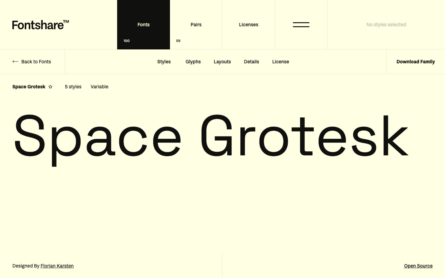
| Sans display + serif body | Space Grotesk + Source Serif 4 | Editorial product with tech brand |
| Single serif system | Literata for H1–body | Pure publishing sites |
Generate pairs on Fontjoy. For geometric display sans partners, see Fonts Like Futura.
How to test serif fonts before launch
- Paste real articles — Headings, links, block quotes, and captions—not lorem ipsum alone.
- Check bold and italic in running text — Weak italics break emphasis in long copy.
- Measure line length — Serifs need comfortable measure (roughly 60–75 characters); ultra-wide layouts exaggerate contrast faces.
- Load WOFF2 subsets — Latin only unless your locale needs more.
- Document the license next to font files in the repo.
Identify competitor stacks with Fonts Ninja; browse trend lists at Typewolf.
Common mistakes with serif typefaces
- Didone display as body — Playfair-style hairlines disappear at 16px.
- Too many serif families — One text serif + optional display is enough.
- Ignoring system fallbacks —
Georgia, 'Times New Roman', serifprevents empty boxes during font load. - Chasing “serif examples” from print — Classic book serifs may lack webhinting; prefer families with explicit screen masters.
FAQ
What is a serif font?
A serif font is a typeface with small strokes at the ends of letter stems. Serifs traditionally aided print readability and now signal editorial, literary, or premium brand tone on the web when used at appropriate sizes.
What are good serif font examples for websites?
For body text, try Source Serif 4, Literata, Merriweather, or Lora. For headlines, Playfair Display, Cormorant Garamond, or Fraunces. Match the style to your brand—transitional for general reading, didone for display drama.
What is the difference between serif and serif typeface?
No practical difference for designers—serif font and serif typeface both mean a family with serifs. “Typeface” is the design; “font” is often the file or weight instance.
Are serifs outdated for web design?
No. Serifs are widely used in modern editorial sites, luxury brands, and hybrid product/marketing pages. Dense app UI still skews sans, but serif fonts remain strong for reading-length content.
How do I pair serif fonts with sans serif?
Use contrast: a high-contrast serif headline with a neutral sans body, or a geometric sans hero with a sturdy serif for paragraphs. Avoid pairing two competing serif families in the same layout.
Next steps
- Name the job—display, body, or accent slab.
- Shortlist two serif typefaces and test real copy at 16–18px.
- Pair with a sans from Humanist Sans Serif Fonts or Best Web Fonts.
- Ship WOFF2 subsets and keep the license link with your assets.
For Times-specific familiarity (resumes, academic templates), see Times New Roman Alternative Fonts.
Enjoyed this story? Share it or follow on Google.