- Futura Alternatives
- Typefaces Like Futura
- Geometric Sans
- Space Grotesk
Fonts Like Futura: Free and Licensed Alternatives for Web and Brand
Need typefaces like Futura? Compare geometric sans alternatives—free Google Fonts, Fontshare options, and retail look-alikes—with use cases, licenses, and pairing tips.

Sherotree
·6 min read
Futura is the reference geometric sans: circular bowls, sharp vertices, and a mid-century modern voice. Searches for typefaces like Futura usually mean “I want that clean, architectural sans—without the retail license headache (or with a closer match for my brand).”
This guide maps what to copy from Futura (and what not to), then lists Futura alternative fonts that work on the web—free open families, free foundry options, and paid paths when you need the real thing. Pair candidates on Fontjoy, lock sizes on Typescale, and compare geometric vs humanist choices in Humanist Sans Serif Fonts.
Key Takeaways
- Futura’s signature is geometric construction + tight graphic color—not every round sans is a substitute.
- For web projects, start with Space Grotesk, Montserrat, Jost, or Nunito Sans (verify live licenses) before chasing unofficial “Futura” downloads.
- Retail Futura and Futura PT need proper webfont/app licenses; desktop files alone are not a production stack.
What makes Futura distinctive
Before swapping fonts, list the traits you actually need:
| Trait | Futura behavior | Why it matters |
|---|---|---|
| Geometry | Near-circular o, pointed M and A | Drives the “modernist poster” look |
| Proportions | Tall x-height in many cuts | Works for headlines; body can feel tight |
| Weight range | Light through bold with clear steps | Marketing systems need more than Regular/Bold |
| Tone | Confident, editorial, Bauhaus-adjacent | Wrong for soft humanist or handwritten brands |
Typefaces like Futura should match the role (display headline vs UI body) not only the silhouette. A geometric alt that shines at 64px may fail at 14px label size.
Futura vs Futura PT vs “free Futura”
- Futura (Linotype / URW lineage) — Classic retail family. License per channel (desktop, web, app).
- Futura PT (ParaType) — Common on design blogs and Adobe ecosystems; still retail—read the EULA for web embedding.
- “Futura free download” mirrors — High risk: wrong license, incomplete charset, missing weights, or renamed clones. For production, use an explicitly licensed alternative or an open OFL family.
If you only need the aesthetic, open Futura alternative fonts below are safer than unverified ZIPs.
Best Futura alternatives by scenario
Headlines and brand display (free / open)
| Font | Similarity to Futura | Use when | Skip when |
|---|---|---|---|
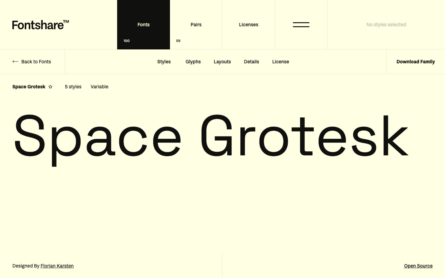
| Space Grotesk | Geometric with tech character; popular Futura-adjacent choice | Startup heroes, feature titles | You need a neutral body face in the same family |
| Montserrat | Urban geometric; strong poster presence | Marketing landings, all-caps CTAs | Dense tables and long paragraphs |
| Jost | Futura-flavored geometric; multiple weights | Posters, packaging-style web heroes | Ultra-compact UI at 12–13px |
| Spartan | Bold geometric display | Short headlines, logos in text form | Body copy |
Comparison with another geometric grotesk: Switzer vs Space Grotesk.
UI and product chrome (more readable than pure Futura)
| Font | Notes | Use when |
|---|---|---|
| Nunito Sans | Rounded geometric; softer than Futura | Consumer apps, friendly SaaS |
| DM Sans | Low-contrast geometric | Dashboards that still want round geometry |
| Inter | Not geometric—neutral UI grotesk | When Futura was only a moodboard reference |
See Inter for Inter-specific embed notes.
Retail / close commercial matches
When the brief literally says “Futura or nothing,” budget for Futura, Futura PT, Avenir, Century Gothic (system on some platforms—not a web strategy), or Brandon Grotesque-class retail faces. None of these are drop-in free substitutes; they are licensed products.
How to pick among typefaces like Futura
- Name the job — Hero H1 only, or full UI system?
- Print the stress string —
HAMBURGEFONTSIVat headline andIl1 O0at 14px. - Check license channel — Website WOFF2, Figma marketing files, and mobile app embedding differ.
- Limit weights — Display sites often need 400 + 600 or 700 only; do not ship the full family.
- Pair a quieter body — Futura-like display + humanist sans or serif body is a durable pattern.
Browse more geometric and trend-forward lists on Typewolf; validate every pick against your license stack.
Pairing Futura-style display with body fonts
| Display (Futura-like) | Body partner | Why it works |
|---|---|---|
| Space Grotesk | Source Sans 3 | Display geometry + humanist readability |
| Montserrat | Literata or Source Serif 4 | Poster sans + editorial serif |
| Jost | Inter | Sharp hero + neutral UI |
| League Spartan | IBM Plex Sans | Bold geometry + technical warmth |
Test pairs with real nav labels and pricing tables—not only “Aa Bb Cc” on a mood board.
Common mistakes when replacing Futura
- Using display geometry at body sizes — Futura-like alts often need a second text face.
- Tracking headlines too tight on web — Print Futura layouts do not always survive responsive line lengths.
- Assuming Google Fonts = identical to Futura — Similar vibe ≠ identical metrics; expect layout reflow when swapping.
- Skipping tabular figures — Pricing pages need
font-variant-numeric: tabular-numsor a family with built-in tabular styles.
FAQ
What font is closest to Futura for free?
Space Grotesk, Jost, and Montserrat are the most common free starting points for typefaces like Futura on the web. “Closest” depends on weight and use case—compare at the exact px size you ship.
Is Futura on Google Fonts?
The original Futura is not on Google Fonts as a libre family. Use licensed Futura/Futura PT from a foundry or Adobe, or choose an open Futura alternative from Google Fonts or Fontshare.
Can I use Futura for commercial websites?
Yes, with a proper webfont license from the rights holder. A desktop OTF alone does not grant web embedding. Read the live EULA for your account type.
What is the difference between Futura and Avenir?
Both are geometric-influenced, but Avenir is more humanist in proportions—rounder, less severe than classic Futura. If Futura feels too sharp, Avenir (licensed) or Nunito Sans (open) may fit better.
What serif pairs with Futura-style sans?
Try Source Serif 4, Literata, or Playfair Display for contrast. Keep the serif for body or subheads, not competing geometric display.
Next steps
- Decide if you need licensed Futura or an open Futura alternative.
- Shortlist two geometric candidates and test at headline and UI sizes.
- Add a body partner from Best Web Fonts for Websites.
- Ship WOFF2 subsets and document licenses beside your font files.
For free catalog browsing beyond this list, see Best Free Modern Font Sites for Designers.
Enjoyed this story? Share it or follow on Google.